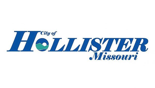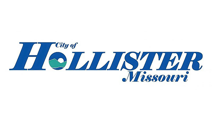
Over the next six months people in an around Hollister can expect to see the old city logo being replaced by a new logo. “As we grow and look toward the future, we wanted to find a simple logo that could easily be adapted, used across various platforms easily, and that was more visually focused on the name ‘Hollister,’ than the old one,” said Denise Olmstead, Hollister Assistant City Administrator. “We believe the new logo does that and look forward to its continued gradual implementation over the next six months or so,” she added.
Olmstead points out that logos development started with research to the logos of cities both regionally and around the U.S. that had easily recognizable labels and had used them across all their platforms. She defined “platform” as anything the logo would be applied to or used for covering thing such as stationary and business cards, to vehicles and social media.
The next step was taking, what they believed to be, the best of those ideas, and incorporating them, with local input from city employees and others into the final logo. The color blue was chosen because it relates to the logo colors other community organizations, such as the Hollister Tigers, as was the large blue “H.”
The symbolic”O” in “Hollister provides the flexibility to be used separately when appropriate The green “mountain symbol, with its jagged top and wavy line at the bottom reminds of the Ozark Mountains, green space, and the lakes and rivers that are such a large part of Hollister’s heritage and who it is. That theme is reinforced by the “sun” rising over the “mountain” and the blue color surrounding the symbols.
From a practicality point of view, Olmstead said that it allows for a wider and more efficient use across the different platforms it will be used on because, from a details perspective, it is less complicated than the old logo as far as details. “We believe that, in as much as an efficient logo can, our new logo provides a simple yet elegant glimpse of Hollister.”
Olstead said that the Hollister Board of Aldermen approved the new logo at their Dec. 6, 2018 meeting.

